Showing posts with label how to draw. Show all posts

Monday, December 24, 2012

Murder on the Dance Floor


This, essentially, is part two of Y U SO MAD? . The inspiration came from two different places. The first one was the angry teddy bear. Seeing him all beaten up an tattered I couldn't help but wonder, who did this to him. Was it for the same reason the boy looked so bored? After thinking that I also remembered a comment from a coworker when he saw me drawing the teddy bear. He asked me why do all my characters look sad, why no happy ones? And there was my second inspiration. Because what if the one who beat Teddy was a Bunny. And what if Teddy lost a fight that would explain the bad mood, but also it would mean that whoever won is happy. And so I decided to go with contrast - I had a sad annoyed looking boy so I drew a happy girl. I had an angry beat up bear do I drew a cute murderous bunny. It all makes sense to me! I decided to add one more contrast and that was color. This is the first time I'm using it here and the reason for it was contrast. I needed it to show the happy feeling in the second pic. All in all I like this it's just my style - cute but creepy.

Don't let Bunny scare you!

Friday, December 21, 2012

Y U SO MAD?


After having a bit of artist's block for about 2 days I decided to follow my own advice and took my notebook in my purse to work. Now, since this is the holiday season my workplace is covered in snowflakes and Christmas trees and all that office decoration. So when I arrived early and finished my class prep with 20 minutes to class to spare I decided to take out my notebook and do some random doodling. I looked around, stared off into space for a while and then decided, well, let's go with cartoon Santa.
 
    I started with the hat first and it came out pretty good, I then drew the face. This is the part where I hit a wall, though. See, Santa has a very big, very specific looking beard, that I have no idea how to draw. So without thinking much about it I decided to switch from bearded Santa to a beardless someone else. I made the coat and then the pants and somewhere along the way the idea of a young boy formed in my head. So I changed the Santa hat to a winter one and called it a day.

    I knew ,though, that I didn't really want a happy looking kid but I didn't want a sad, mopey one either, unfortunately that's what I ended up with. I erased his face and decided to just go with the flow. So far this drawing was something that simply came to my mind. So after working on the coat and pants some more I just decided that this looked like a very bored young boy and drew him some droopy, cynical eyes.

   After finishing him up, doing the shading and going over some of the lines to define them better I looked at the finished picture and noticed that it was just a boy - no background, no composition, nothing to balance him out. So I looked a bit closer at him and wondered, doesn't this boy look like he's missing his teddy bear. His rough, scarred, angry, mad looking gangsta teddy is the perfect addition. For the drawing of the bear I looked at drawings on the net and two pictures caught my attention. One is a simple outline drawing of a teddy and the other a digital guide to drawing a busted, badly beaten teddy.  So after some trial and error to get the size and proportion right I did some shading and finished him up.

And here he is, my mad as can be teddy, fresh from the last fight where he beat the crap out of that stupid b%&# Barbie.

Teddy Out!

Thursday, December 20, 2012

The Call of Nature


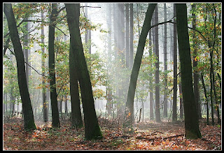
The best and most complicated drawing I've made so far is this landscape. The whole thing started with my old friend Mr. Crilley and his video about artist's block in witch as a background he's completing some work project. Said background is a manga style forest with some very cool looking trees. After seeing them I decided - forest it is! So I consulted my good friend Google, found a picture I liked and started on it. I used this as a reference for the composition and placement of the trees, however, as you can see, in this photo the light source is behind the treeline making the trees themselves look like silhouettes. So I decided to switch the light direction to the opposite (behind the onlooker) and draw the trees in some detail. I decided to use Mark Crilley's style for the trees themselves. I stated with a basic outline for the main 3 trees then put the bigger background ones and finally decided to outline some grass and the ground in general.

     However what I discovered was that I, apparently, can't draw manga style grass. This proved to be a big problem. I had to find some other way to draw grass. As simple as grass might be in real life, for a drawing, it can be a pain in the butt. It certainly was one for me.  After looking it up on the internet, I came across this very useful tutorial and decided to go the semi realistic way. After drawing the basic tree trunk shapes I went in and did some detailing - in this case it was simple lines randomly placed to represent the texture of the bark. I made the lines darker and more closely spaced as I went from foreground to background trees. Lastly I added the small saplings and the leaves. Here came second big hurdle I needed to overcome for this piece. For me the difficult pat in drawing trees are the leaves. I found an easy to follow technique on youtube. The original video is an amazing landscape tutorial that I want to try someday in the future. In this landscape there are a few trees as small background details drawn using a stile I've never tried before, however the part where he shows how to make leaves is very easy to understand and follow. As you can see I managed to go from a total tree disaster in my A Wall of Inspiration post to a pretty decent job in the drawing on this page. What the video didn't mention but I found out trough trial and error is that one should be careful with the placement of the leaves - you have to leave small random spaces in between the squiggly bits then put some light line work there to act as the small branches. This way the tree has a more natural feeling to it.

 However as I finished it I felt it didn't match up with the style of the grass. The trees look a bit flat because of the lack of shading. Having realized that my original, simple, manga-like idea wouldn't work I decided to try and shade them. Thinking about it, to me, it looked like the light coming from behind means the trees will be dark on the sides and light down the middle. With that in mind I started to shade and ended up with a bunch of dark, generic and still very flat looking trees. The only success that I had was in covering up the little detail there was.
So what do I do now? Well after watching the tutorial video for the leaves I decided that some well placed eraser marks would do the trick. Now this is the place where I have to say that having a good eraser with a sharp edge to get into small spaces is a great idea and investment. I unfortunately did not have one of those. Erasing just the right bits without destroying all of the previous work was tricky to say the least. After some careful erasing I managed to create a decent highlight fading nicely into the darker shadows. To finsih everything off I put a few lines for bark texture as I did in the beginning.

    In the end what I had was my best work so far, a believable looking forest with some semi-realistic, if slightly drunk looking, trees. Using some basic research and the knowledge of others I managed to have visible improvement in a week. So this is my wisdom for the day - use whomever you can get your hands on to. Every problem that you may encounter while drawing , someone else already has seen it, thought about it
and probably solved it as well. Be smart with your time, be resourceful and be the best that you can.


Tuesday, December 18, 2012

The Daily Commute


   I take the train to go to school and work. My daily commute is usually very entertaining and includes fun activities like staring blankly at my phones screen hoping it suddenly has something fun to show me and listening to the same old five songs I have on it, because I always forget to update it. Sadly sometimes I forget my headphones and am forced to listen to the sounds of the life surrounding me. On one such faithful day I was sitting on a crowded train ... well not on it - you get what I mean! So I was sitting on the train fascinated by all the different exciting smells, like day old sweat from busy office workers in grey and black suits or the complicated nuances of the multilayered smell coming off of the seats (pee, it's mostly pee). In this amazingly creative environment the floating electron of a stray idea hit me and I decided I was going to draw the train! Creative, I know! So again I got home, did my research, found a picture I liked and sat down with a blank page, a ruler and a pencil. This was the end result.

  This, just as it looks like, is a simple to do, mostly straight lines drawing of an empty train wagon. That being said this did have a few hidden traps waiting to spring on me. The first one was the bend on the ceiling.  As most train cars this one was also not a perfect square, meaning there is a part of the ceiling protruding out. On page it started out as 3 lines connected in the far end of the car.  I used 2 different shades to give it some dimension and then put some parallel lines in two different directions so that the whole section appears as if sticking out. Now, it did take me a few tries to get the angles right so that the bottom part doesn't appear too far away. That being said this part was fairly easy.

  The real difficulty here came from the seats, because you have to make them appear round and shapely. Especially the end of the seat has a specific round edge that helps it appear 3 dimensional. Making the roundness just right was the thing I struggled with the most and if you look closely some of the seats still look flat even though most come across as plausible. 

   The rest is pretty straight forward, I used some simple shading to give it some tones and separate all of the objects, used a softer pencil to darken some of the sharper lines and called it a day. I know I can improve on this drawing and maybe someday I will but for all intents and purposes I'm done with it for now. It was a good exercise and came out simple but nice. I did draw the endless train but if you didn't know any better you might think it was on purpose, right? Right! Even though my baby is still in the hippo category I'm now the mommy of a handsome young hipposter.                   


Monday, December 17, 2012

A Wall of Inspiration

A few weeks ago I came across a How To video on youtube by a professional manga artist called Mark Crilley. In this video he showed how to draw an old crumbling wall as a background. I found it amazingly cool and simple enough for me to try out. So I watched the video did a quick google search for cracks in walls and found this. I looked at a few other ways cracks are made and then proceeded to shamelessly copy Mr Crilley.

   A few things that I noticed while drawing it were that cracks are pretty easy to freehand. You just need to go from darker in the begging to light towards the end. After that any old crooked line can pass as a wall crack. Next important detail were the bricks - their lines don't touch when you draw them.  The lines between the lines end up looking like brick mortar. I first drew them out with a ruler using a very thin line and after I went in with the pencil and did the rounding of the edges.

  When it comes to the wall itself a good tip is to make it splotchy. Randomly darken here and there then go over with the finger and make a nice big mess - that seemed to work for me. The rest of the details are shown really well in the video so I won't bore you repeating them.

For the foreground unlike the video I decided to draw sidewalk tiles. So again I did my google search and looked at a couple of pictures. I think by now you get how this goes. The problem here was the depth of the picture. I can't just make parallel lines because the picture would end up looking flat. So I enlisted the help of Mr Crilley again and watched his perspective video and more correctly his one point perspective video. So I put a dot on the very edge of the page and tried to make a 3D image. I was mostly successful but failed on some of the little details.

  My biggest problem with this drawing came from the background, which I decided needed something more than clouds. I'm pleased with the way the crane came out but the rest of it is a bit of a mess. Starting with the building witch in the beginning had an impossible perspective ( that was corrected thanks to helpful friend) the size of it doesn't match anything in this picture and it basically looks out of place. And don't start me on the tree - I have no words to explain that one.

  All in all as a first try I'm a proud mama of a slightly deformed and quite ugly baby hippo, but like a good mommy I love it nevertheless.